Welcome to Monapart, where the most beautiful homes find new owners in an easy, pleasant and safe way. As Design Manager of the brand, I have had the privilege of participating in the creation of a new corporate identity for this real estate company based in Spain, which has undergone a significant transformation by migrating to an online platform for the management of real estate sales.
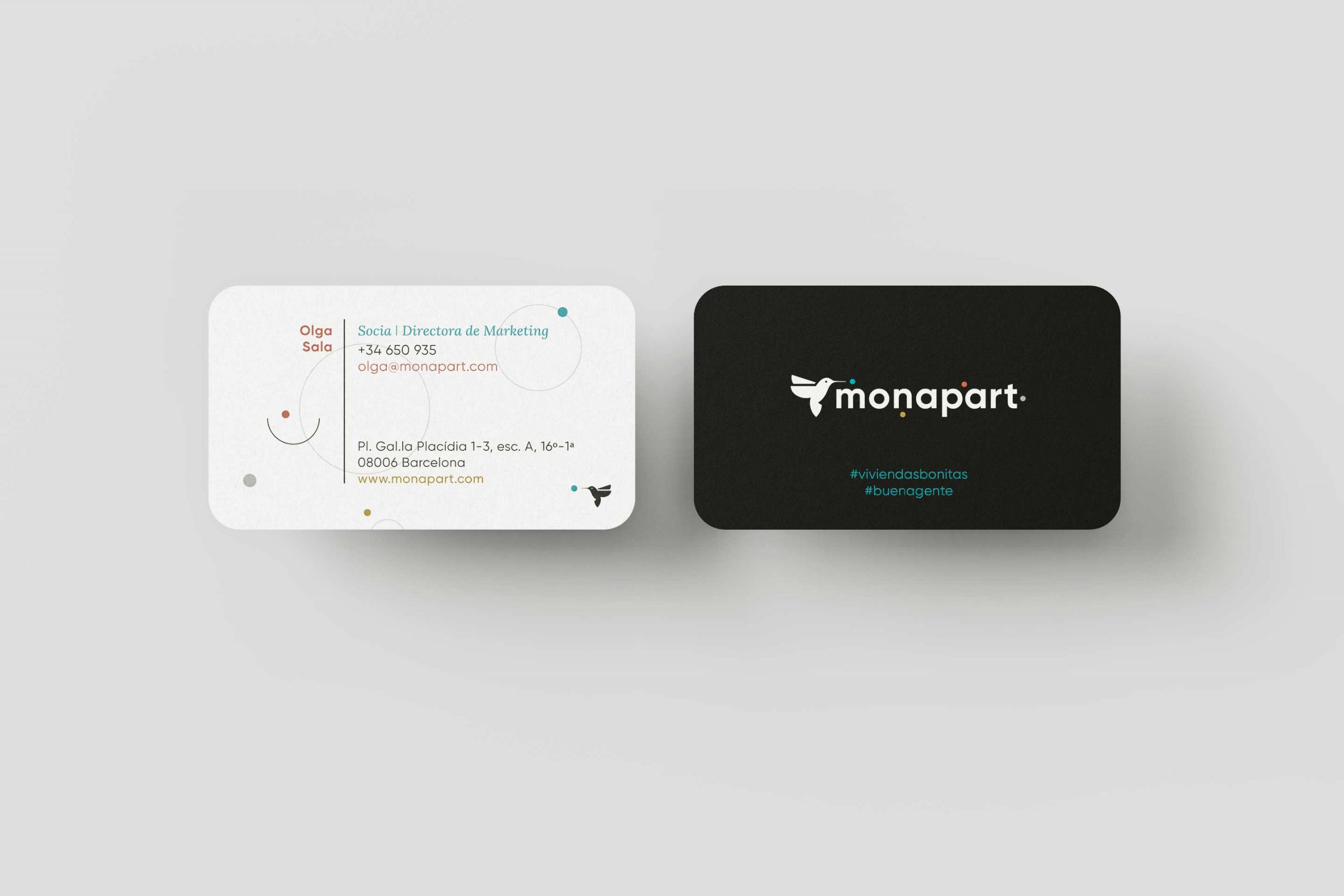
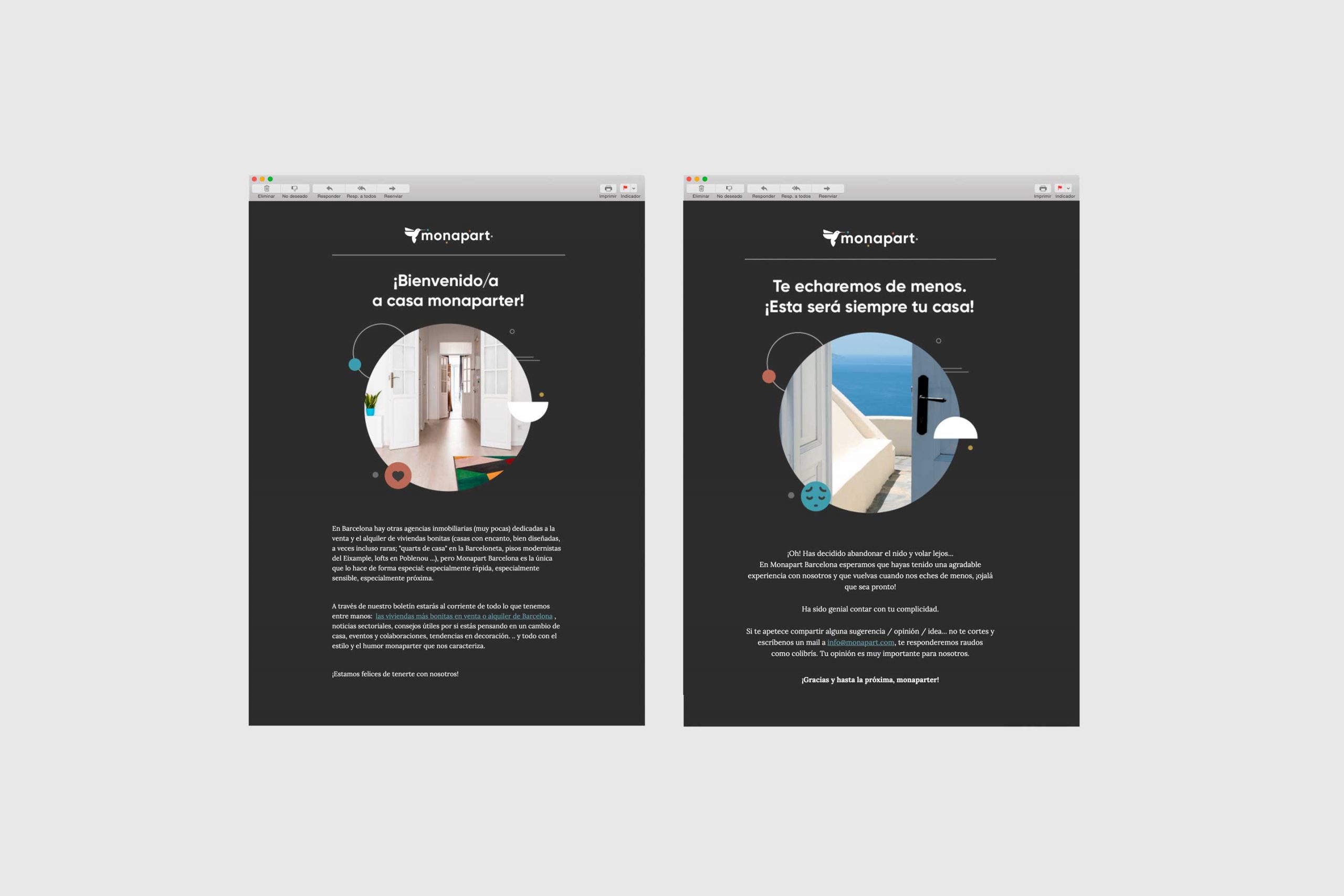
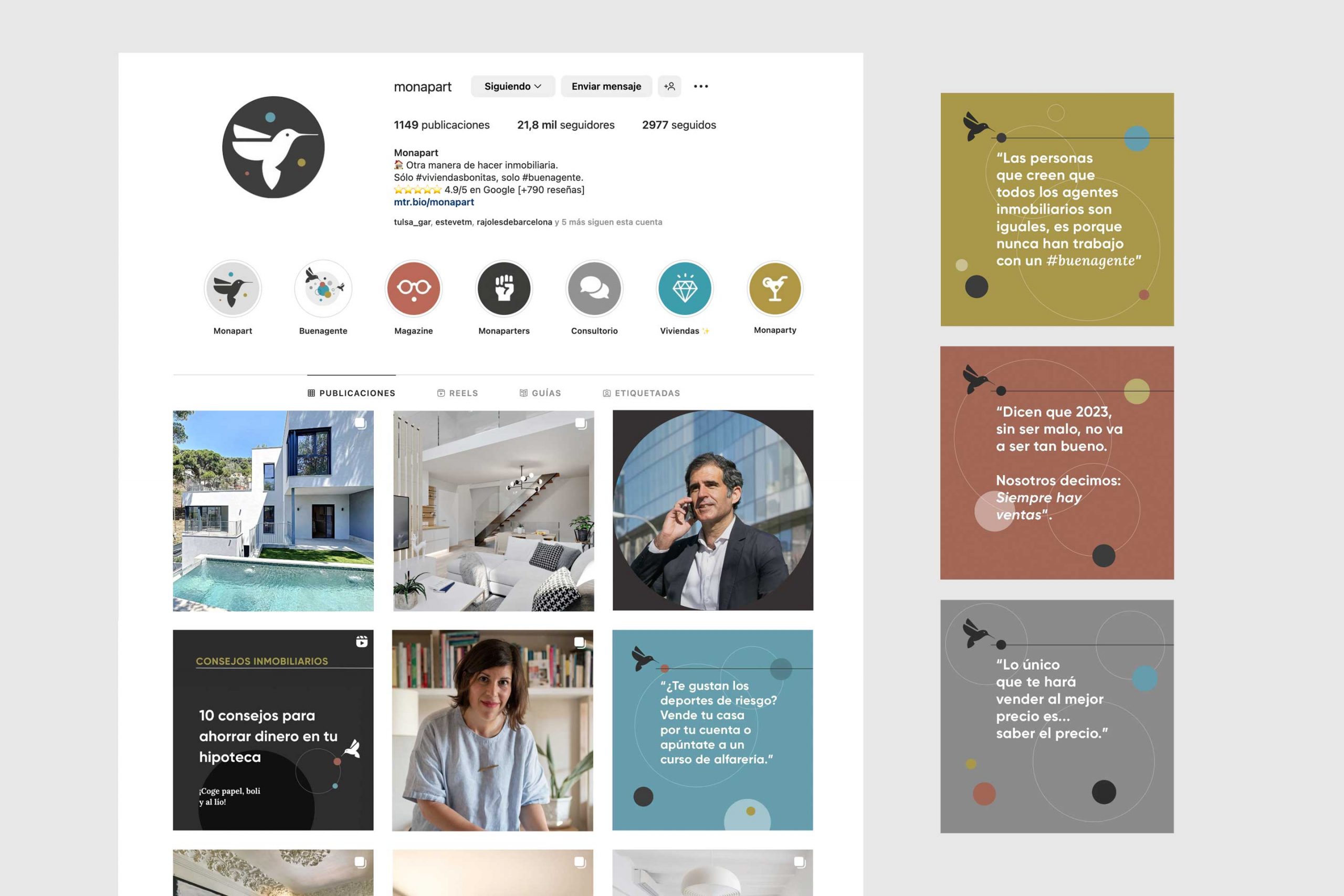
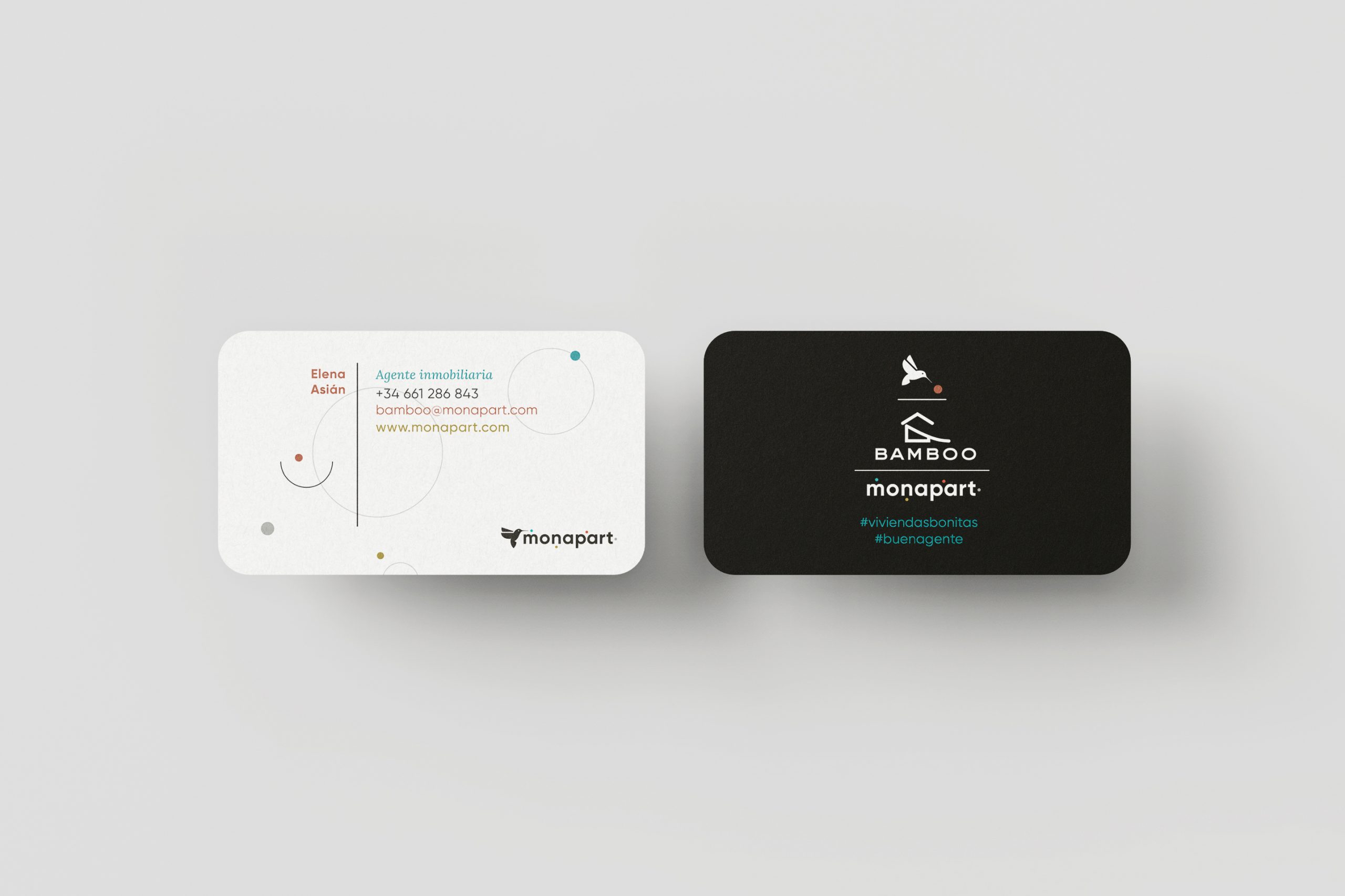
My work in branding was not limited to just logo design. A complete new visual identity was developed, ranging from typography to illustrations, color palette and photography. This process resulted in a distinctive visual language that reflects the brand’s communication style, its unique personality and its strategic approach to adapting products and services to each type of user, especially real estate agents.
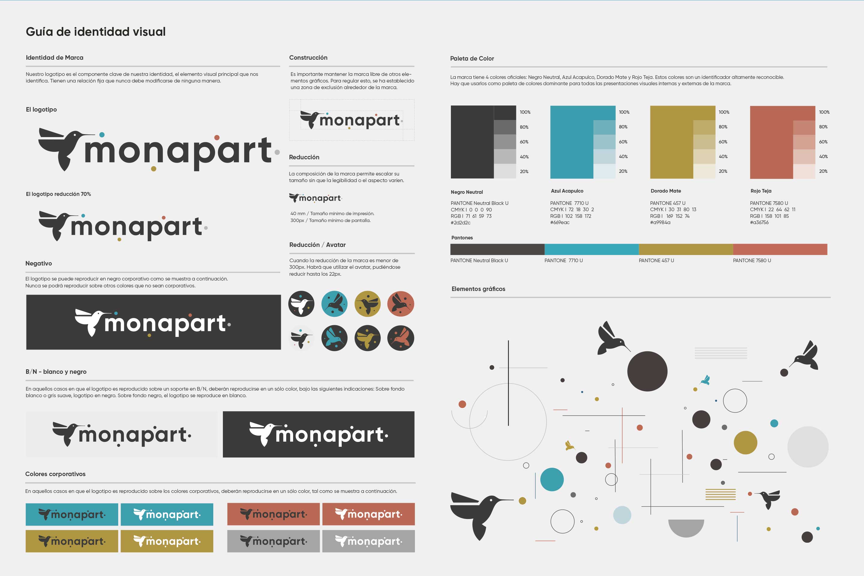
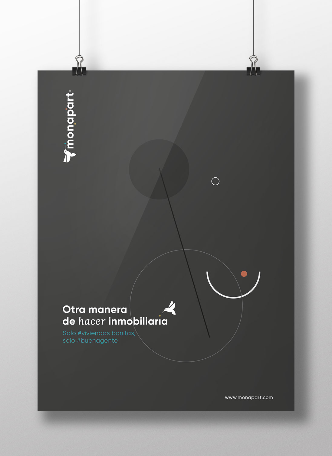
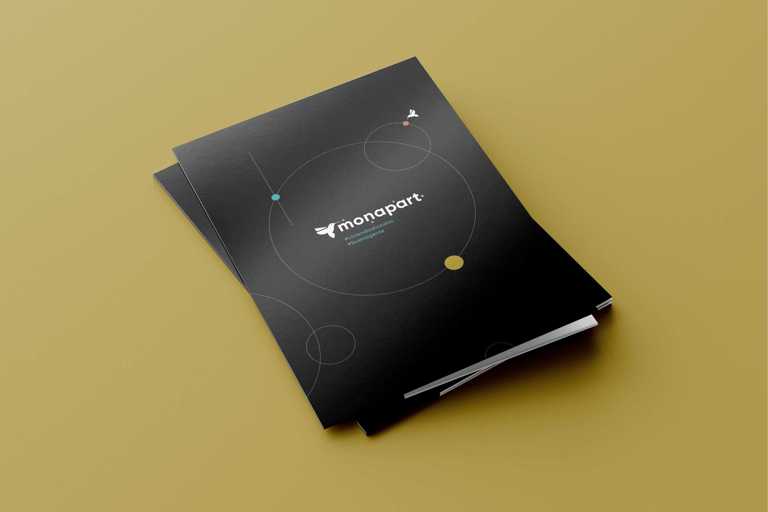
The brand icon, represented by a hummingbird, encapsulates the essence of Monapart. Like this mighty little bird, the company strives to be agile and efficient, selecting only the sweetest and most rewarding options for its customers. Just as the hummingbird looks for nectar in flowers, Monapart looks for the most beautiful and special homes to offer to those who trust it.
As for the color palette, we were inspired by the chromatic richness of the architect Le Corbusier. We use warm and neutral tones to infuse the brand with sophistication and elegance, creating a coherent and distinctive visual identity that adapts to its different audiences.
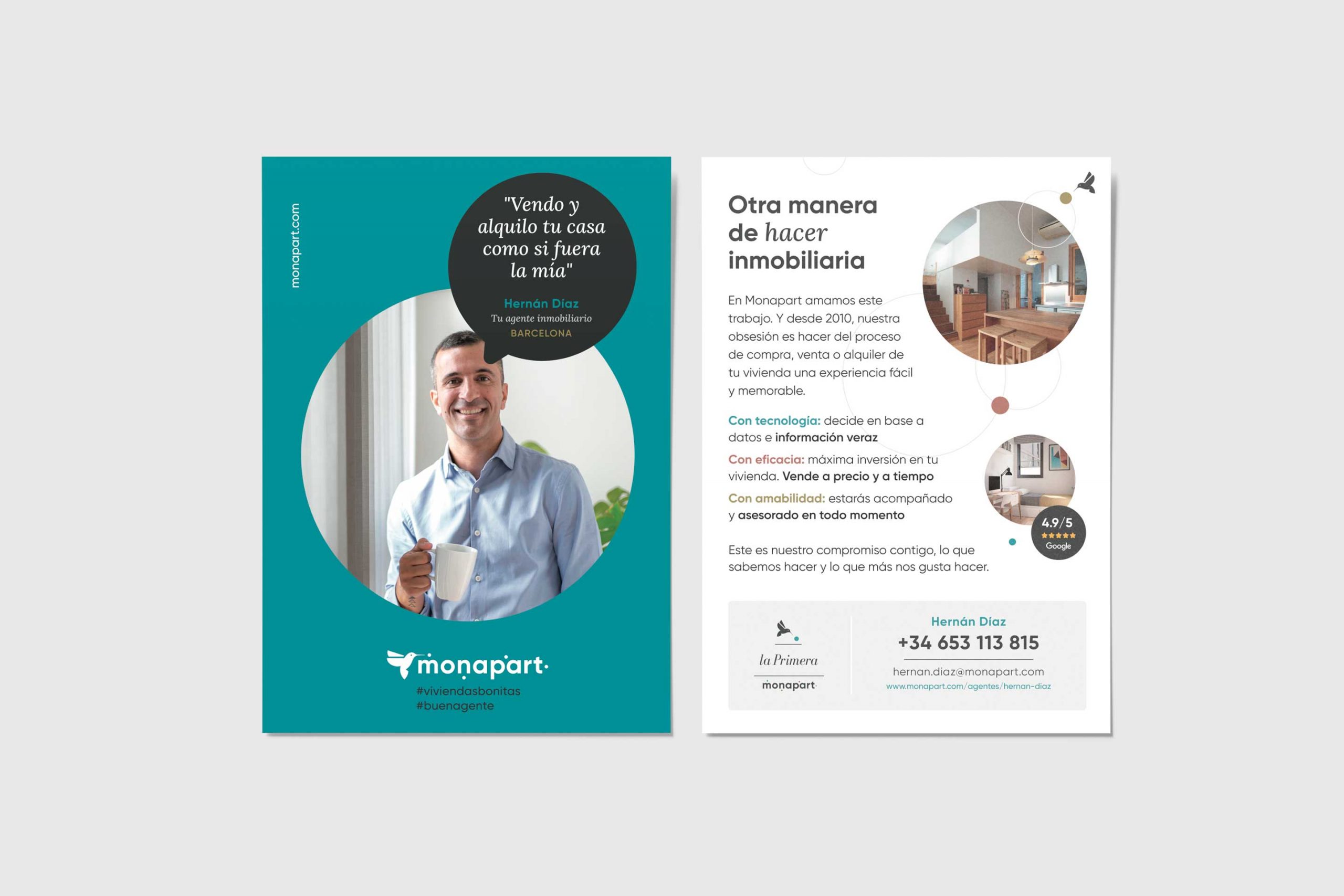
At Monapart, branding goes beyond the logo: it is a commitment to excellence, authenticity and customer satisfaction. Explore my work through photographs and discover how Monapart’s new visual identity reflects their passion for exceptional homes and the real estate experience they offer.